
A guide to extract insight using Provision’s data exploration offering
Data exploration is an important step in the data science project lifecycle. Even though it may not be needed for supervised modelisation because algorithms are now powerful enough to build a good model without human insight, data exploration may still be useful when starting the project for the following reasons:
to check data quality and integrity ( even if « missing data » is still an important insight )
to get the best outcome expectation with visual hint
onboard the line of business users and formalize the goal of the project
The last point is probably the most important.
In every Data Science project, the first, and one of the most important steps, is to define clear objectives that serve a purpose. Exploring data with visual tools often allows us to get insight from business experts and get them involved in the project.
Data exploration in the Machine Learning pipeline
What’s data exploration ?
We define data exploration as any process that takes raw data and produces indicators and charts for humans to analyse. Statistics is a kind of data exploration. Scatter plot and histogram are another kind.
Sometimes, Humans can build very basic models from statistical indicators and get rules-based models like if age > 40 then wants_motorbike = true.
In a Machine Learning project pipeline, Data exploration may serve the 3 following purposes :
Getting insight
Checking the data quality for modeling
Talking with the Line of Business
Getting insight
Before any modelisation, the first step of any machine learning project is , or at least should be, data exploration.
Before the advent of Big Data and Machine Learning, most data analysis was done visually and data Insights were extracted by humans from statistical indicators and charts.
Data Analysis is getting replaced with Artificial Intelligence and Machine Learning for understanding phenomena and building models but the human mind is still great at getting insight from visual clues.
Exploring data may still help to build the target, decide modelisation type or find an innovative feature engineering. Sometimes it serves to detect underrepresented categories and add some weight to the data.
My Advice
Do not build segmentation for Machine Learning and AI problems !
Segmentation was a great way to build basic models but Big Data and Machine Learning tools do not need segmentation anymore as they work on individual samples.
Only use segmentation to build basic rules-based models or explore data and understand problems. If the project needs performance, use supervised learning.
Checking the data quality for modeling
Even if building a model only using data exploration is not the best way to get performance, data exploration can serve as a show stopper as it can highlight two main issues from your data before going on the modelisation step :
random or noisy data
too much unbalanced data
There are specific indicators for noisy data or signal/noise ratio and this can be seen from some specific visual representation. Looking after a too low signal/noise ratio is a good way to avoid poor modelisation due to poor data quality.
When exploring data with visual tools, noisy data will look uniformly spread with no structures or shape emerging. As the human brain is quite good at detecting shape, absence of visual shape is often a good indicator that there is no signal in our datas.
About unbalanced data, it’s still possible to get good models if the low rate target has some very specific features , which will probably appear in the data exploration process. As a rule of thumb, looking for the general shape of data and some under-representation of sur-representation for planning some kind of weighting is considered a good practice.
Typical visual clues will be very small samples aggregated into a larger one.
Talking with the Line of Business
The most important output of running data exploration, especially with visual tools, is to onboard the line of business manager into the data science project.
Success for a data science project often relies on building a good target that serves a true business purpose. By running a data exploration phase with someone from the business, you can, as Data Scientist Practitioner :
get insight to build your metrics and objectives, and thus optimize the model for ROI
get the stakeholders involved and build a relationship to build the fittest model for business.
Data exploration technique focus : Data Embedding
Data exploration often relies on the 3 following methods :
build statistics for each feature ( average, median, minimum value, number of occurence, mode, … )
build charts ( histogram, pie chart,…)
build chart about some relation between features ( bivariate analysis, correlation matrix, ….)
Basic statistical indicators help to better understand the dataset but still use feature and sample like individual blocks of discrete values.
For example, if one of the features is the names of colors, like “red”, “aquamarine”,”orange”, “blue” or “green”, Statisticals indicators does not use the fact that “aquamarine” is a color somewhere between “green” and “blue”, or that “orange” and “red” are similar colors.
Embedding techniques are various ways to transform data such that you go from a discrete ( categorical and such ) representation of data to a continuous one with mathematical vectors so that samples which are similar are near in the built vector space.
Moreover, these techniques often have the advantage of diminishing the number of features ( dimensions ) needed to represent your sample.
It is a very important method as it allows us to run mathematical operations on all kinds of data ( cosine similarity, difference, addition ) while preserving relationships between features. When embedding data, each sample of the dataset is transformed into a vector with fewer dimensions. This vector may be used to build charts, compute similarities between sample, cluster data or detect outliers.
The main advantage is that when you project this embedding, that can be any number of dimensions, into a 2D space, points that are visually close mean that the sample they represent share a lot of common characteristics.
Data embeddings may serve 4 uses for data exploration :
visualize cluster
compute similarities between sample
detect outliers
visualize segment relative weights
There are many techniques to build embedding but here are the most common.
Remember :
Dataset : a set of samples ( rows ) with features ( columns )
Vector : a way of manipulating and representing your samples. Each sample is seen as a vector , like usual mathematical vectors
Embedding space: a vector space built from your dataset where samples have fewer dimension ( features ) than your original dataset but keep the same level of information
Distance : a formula that given two vectors, or sample, outputs a positive number such that :
distance from one sample to itself is 0
the smaller the distance is between two vectors, the most similar are the corresponding sample from this original dataset
Principal Component Analysis
Principal Component Analysis (PCA) is based on Matrix eigenvector and eigenvalues. When applied on a dataset, it finds eigenvalues and eigenvector of the data and resulting vectors can be interpreted as « axes of greater variance ».
It often puts emphasis on feature correlation and is used as a dimension reduction algorithm.
Let’s say that you have a dataset with 10 samples of 5 features:
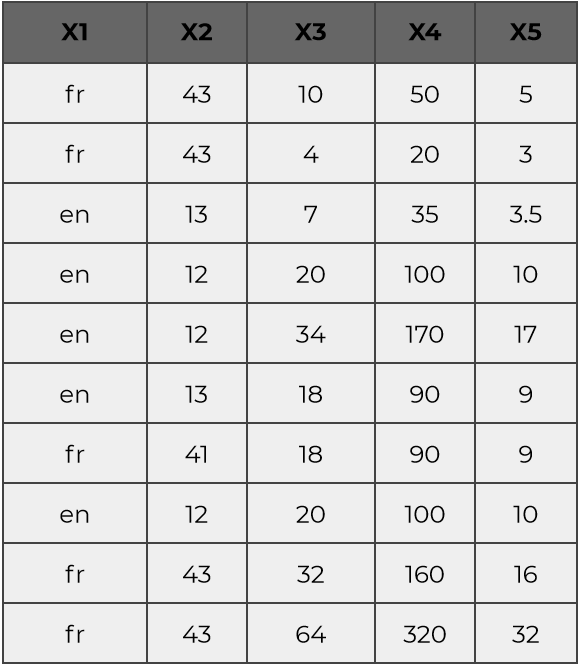
Even if there are 5 features, a close examination will show that the samples are in fact a variation of 2 vectors :
a first one highly correlated with (X1,X2) features ( when X1 is ‘fr’, X2 is close to 12 )
another one correlated with (X3,X4,X5) , that are highly covariant
Thus this 10 sample may in fact be written with only two dimensions :
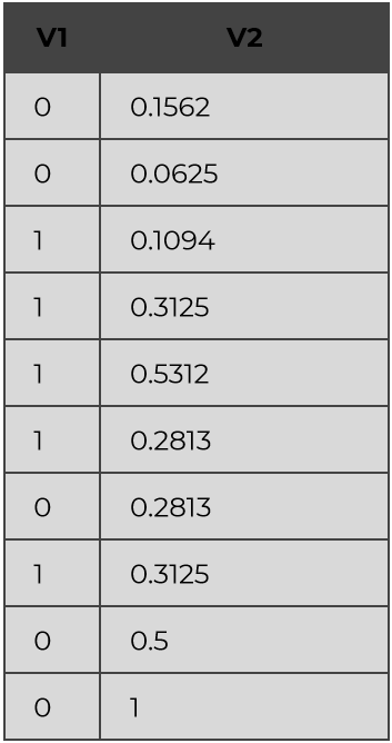
Where :
X1 = « fr » if V1 == 0 else « en »
X2 = -30*V1 + 43
and
X3 = 64*V1
X4 = 320*V1
X5 = 32*V1
That is what running a PCA on a dataset will capture.
Even if the dataset is of a very high dimension ( thousands or more), some of them may be highly correlated to underlying dimensions that are enough to represent your data.
As a result of applying a PCA, each of your samples will be expressed along some axis and each of these axes will get a “variance explained” percentage. The number of axes, and their respective power, gives you some insights about the “true” dimension of your problem.
Variational Auto Encoder
Variational Auto Encoding (VCA) produces outputs similar to PCA, each sample is expressed as a lower dimension vector, but using a neural network to get better results.
Variational Auto Encoding uses a Neural Network that is tasked to generate to its output the vector presented in input but with few neurons ( for example, only 4 ).
The signal in the deep layer of this Network may be interpreted as a vector representation of the sample, called embedding, and has the interesting property that you can build a distance metric such that similar samples have a small metric distance.
Given this property you can build your analysis on the embedding space.
This is what the Provision platform uses for data exploration.
Data Embedding exploration
In order to explain what you can do with embeddings, we use the Provision feature called “Data Explorer”.
You can access a dataset on the following page to try this step by yourself.
Build an embedding
Each time you upload a dataset in your account, you can launch the computing of the embedding by clicking on the “Compute embeddings” button.
After a few minutes the button should switch to “explore Embeddings”, meaning an embedding of the Dataset has been computed.
By clicking it you enter the Data Exploration module.
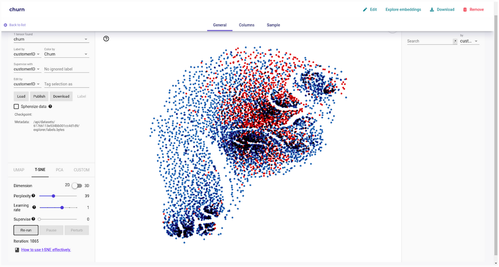
Cluster of customer datasets, and their churn outputs
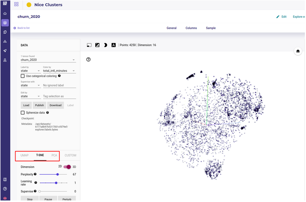
The Data Explorer
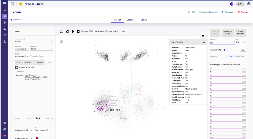
The data explorer. Draw embedding vector on a 3D charts
The data explorer is an interface to handle data rows embedding, or at least a subsample (5000) of it. It projects the data onto a 3D or 2D vector space and gives some tools for exploring data :
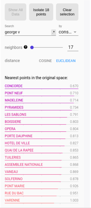
The search and similarity sidebar, on the left, displays nearest neighbors for 2 metrics, cosine similarities and Euclidean distance, when clicking on a point. The number of nearest neighbors is a parameter that the user can change. Note that you can isolate a point and its neighbors for further investigation
The labeling box on the top left corner allows you to assign labels and color to sample along some feature. You can display modalities ( or values ) of features as a label or as a color.
The clustering box on the bottom left let user launch a clustering :
PCA : fastest but do not respect distance
TSNE : better but slow and complex to use
UMAP : less good than TSNE in respecting distance but fastest and a little bit easier to use
The central window displays a navigation interface when you can pan, rotate and zoom.
From this tool you can now start exploring your data
Quick evaluation of your problem
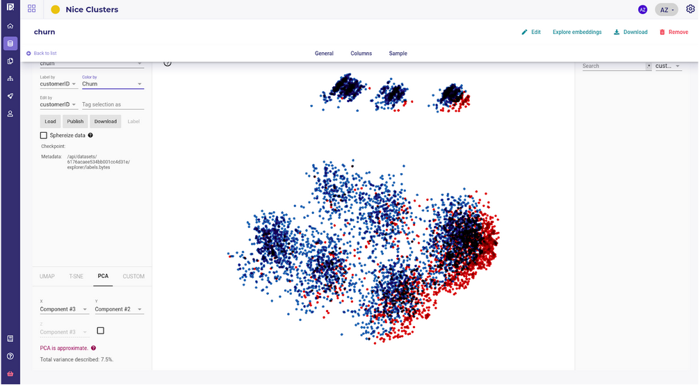
First representation available when opening the data explorer is PCA.
A very quick yet very effective method is to color your sample with the targets by using the “Color By” dropdown menu and then rotating your axis projection to see how each sample projects along each axis :
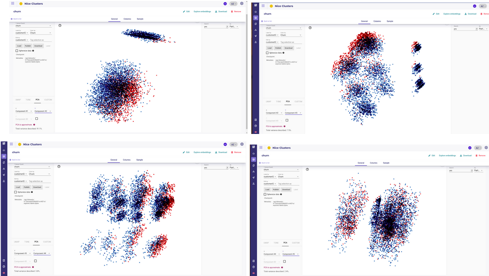
This should visually show 2 main points before starting your project :
Are the datas splittable along some axes ?
are the targets blended within others samples ( or in the case of a regression, is there gradient of colors visible ) ?
If PCA shows no split ( except along your targets of course ) and blended colors, it often means that your signal is too noisy to get anything from your data.
This step should allow you to stop the project quickly, or at least evaluate the data available vs the goal ( target ) you aim to achieve.
A typical example of a “difficult” problem is this kind of embeddings :
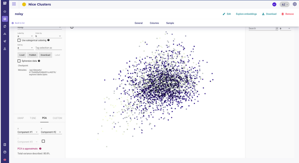
The Big Data Ball of Death
You should expect a good outcome for your project as most standard data science algorithms will succeed in building a model with these data points :
Visualize cluster
Now that you have vectors that represent your samples, you can start to project them onto 2D or 3D space to visually detect clusters ( and outliers ).
The embedding techniques we used, VAE, lowered the original dataset dimension , typically to about 15 to 20 dimensions, but it’s still too high for a human to grab some structure or meaning.
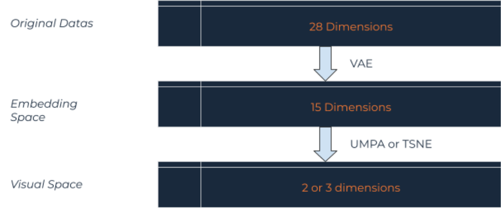
To benefit from human mind pattern recognition, another class of algorithm is used to project high dimensional spaces to lower one, 2D or 3D, while preserving the structure locally and globally.
Structures’ characteristics to preserve are :
cluster : aka group of sample that share similarities ( distance between them are low ) they do not share with other samples
intracluster distances : the more the samples of a cluster are similar, the more compact the cluster
intercluster distance : the more different the cluster are, the further they stand apart
There are two major algorithms to project to 2 or 3 dimension while preserving structures :
TSNE
UMAP
that are available by clicking on their respective tabs on the data explorer.
In most cases, you can tweak the algorithm parameters, keeping in mind that your objective here is looking at :
existence ( or absence of clusters ) : is there some kind of segment in your data ? Should you build one model for all segments or one model for each segment ? Is the target distributed equally amongst them ?
number of of clusters : check that there is not too many isolated small island
separability of your clusters : are your clusters very “far” from each other and is there a trailing sample between them ?
looseness or tightness of your clusters : are clusters very spread and point within them distant from each other ?
Remember that unsupervised clustering is not the best way to get benefits from datacience and you should always spend time defining a target to your problem. Working on visual clusters with stakeholders can help to define your common goal and explain the data.
By using the “Color By” and “Label By” dropdown menu, you can put some visual clues on your clusters and get insight and advice from the Line of Business manager.
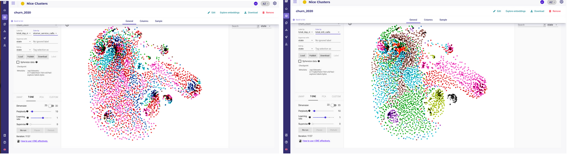
A dataset with some clusters with good inter cluster distance and distinct features
Compute similarities between samples
By transforming your data to mathematical vectors, you are now able to compute distance over them.
There are many ways to compute a distance between two vectors as long as it outputs a positive number and respects some rules, but the most commonly used are Euclidean Distance and Cosine similarity.
As long as you have a distance, it means that for any given sample, you can get the nearest points and study similar samples to see if your data brings enough information to build patterns.
If you use the Data Explorer, the similarity tool is accessible from the right of the screen. You can either click on a point in the main screen or search a specific sample.
Once a point is selected, you can move the slider to input the number of neighbors you want.
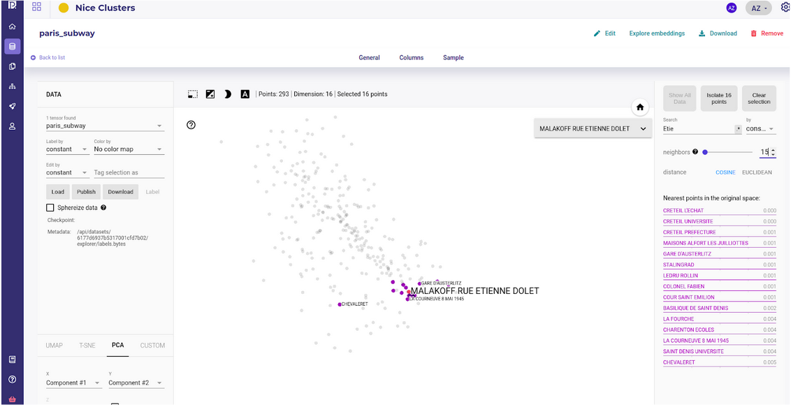
The embedding captures the intuitive notion of “residential subway station” without using any geographical features
This stations share commons traits that are properly understood by the VAE from the dataset reduction
Once again, you should not build a model based on the similarities and distances ( even if the K nearest neighbor algorithm is a perfectly valid method ) because there exists a much more powerful algorithm, but you could use these tools to talk with your stakeholder.
As the notion of “similarity” is simple enough to be understood by the human mind, you should confirm with them that the similarity grabbed by the VAE reflects some intuitive expertise and that some information in your dataset bears this intuition.
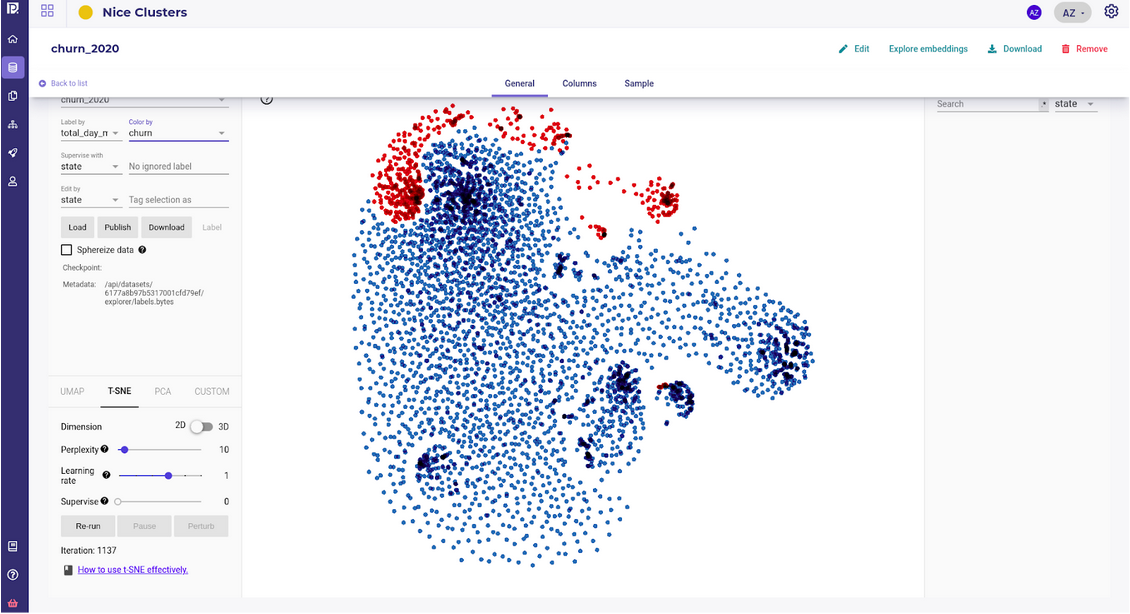
Detect outliers
Another output of building embedding of your dataset is that when projecting them to 2 dimensions , outliers should clearly pop.
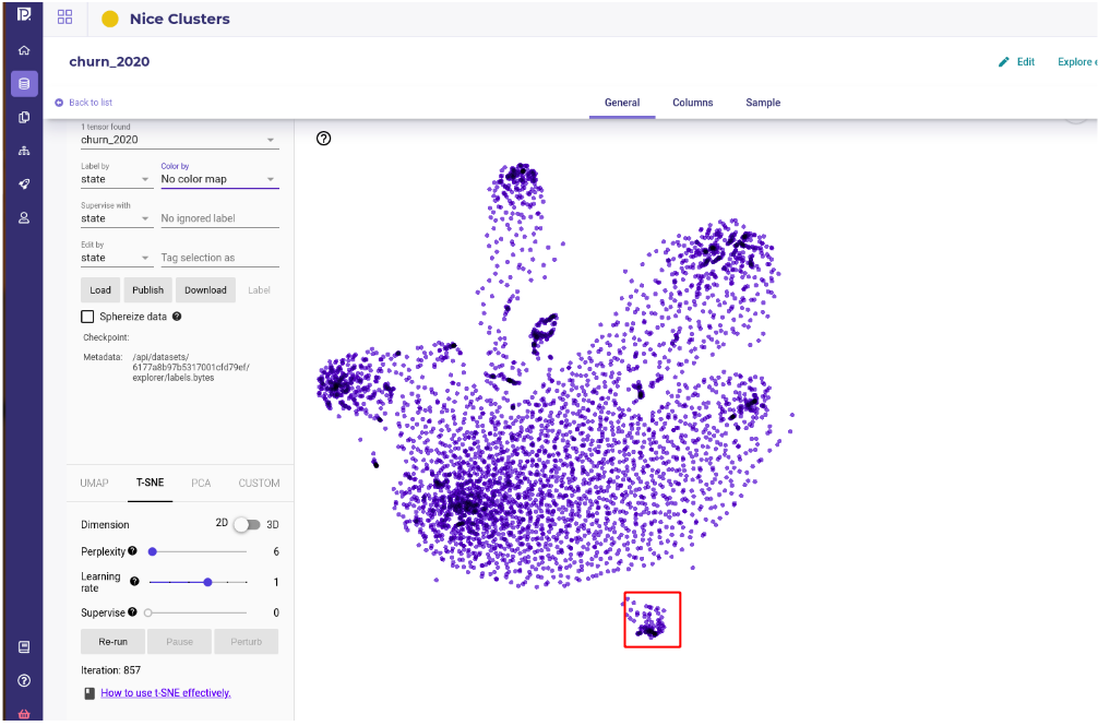
If you built your embedding with a VAE, the samples whose features stand out from the global distribution will be encoding with vectors far from the others.
On the data explorer, or if you build your own TSNE, the outliers will stand apart visually.
If you have outliers, you should probably ask yourself two questions :
What are these outliers ? Are they a transient phenomenon that I should not consider or are they real outliers that could happen sometimes ?
Are they important for my problem and what’s the cost to not consider them ? If I remove them from the training set , and thus do not learn to predict them, would my gain from the model decrease or stay the same ?
Once you have your outliers , you may isolate them.
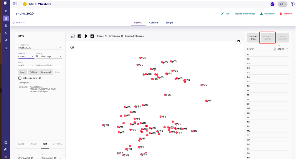
And analyse them with your Line Of Business manager to try to understand their origins.
Visualize segment relative weights and balance data
The last pattern that can help you build your features and models is evaluating the relative weight of clusters.
If some appears from the embedding and clustering application, the relative size and proportion of target within each cluster may help you build some weight columns to balance data or you may even decide to build many different models.
Once again, this is just a way to get intuition about your data and future expectation but this should help you to talk with the LoB in order to confirm that the problem is well understood.
If you see many clusters of very different sizes, always ask your LoB if this is really one problem or if there are, maybe, many problems to tackle and you should build many models.
If one cluster is very small regarding the others , expect to have some trouble with this sample and consider adding some weight if the target is present in this cluster.
Conclusion
You should always consider building embeddings of your dataset.
Embeddings are a transformation applied to your data so that each sample can be manipulated like a classic mathematical vector.
By doing so, you can compute distance between samples that can be interpreted as similarities between them.
By using visualization tools, like colors, and projecting your embedding to two or three dimensions, you can benefit from the human mind’s capability of detecting patterns visually.
Even if these steps rarely get you good models, it is often a good way to onboard your Line of Business Manager as they can share their expertise and intuition with you, a data scientist, using visual tools that represent complex data relationships or properties.
About Provision.io:
Provision.io brings powerful AI management capabilities to data science users so more AI projects make it into production and stay in production. Our purpose-built AI Management platform was designed by data scientists for data scientists and citizen data scientists to scale their value, domain expertise, and impact. The platform manages the hidden complexities and burdensome tasks that get in the way of realizing the tremendous productivity and performance gains AI can deliver across your business.