
How to use Provision.io features to explain and interpret your models
This blog post is the second in the series dedicated to introduce interpretability and explainability in machine learning. If you haven’t already read the first one about defining the concepts, the differences between interpretability and explainability, you can find it here
Below, we will show how the Provision.io platform provides interpretability and explainability solutions: simple model interpretability, model explainability, global explainability and local explainability.
Introduction
In this article we will see how to use Provision.io’s analysis to interpret models such as linear/logistic regression and obtain explanations of methods such as local and global explanations, and feature importances. In addition to the explanation module, we will also see how to use the “what-if” module that we help you to analyze and see how the predictions and explanations evolve when the values of the variables are adjusted and other indicators which allows us to understand your models.
For illustrative purposes, I will use the house sales price estimate dataset available from Provision.io library. Both the training and the holdout datasets can be downloaded freely on https://doc.Provision.io.
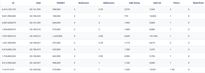
Dataset Preview
Simple Model interpretability
Whatever the machine learning task (classification or regression), Provision.io makes available interpretation for both linear and logistic regression models as well as decision trees with a maximum depth of 5. Considered as simple, fast but often less efficient, simple models can be run without complex optimization and using simple algorithms. Consequently, they can allow us to check whether a given problem can be resolved with a simple algorithm instead of a fancy ML model. Once simple models are run on Provision.io, the following resources are generated:
- A chart that helps us to read and interpret the model
- A Python/R code to implement the model regardless of io’s platform
- An SQL Code to implement the model
Obtained equation formula of Linear Regression on the House Price dataset
As a quick reminder, a linear regression model is defined by the following equation:
Y = aX + b, where X is the explanatory variable(s) and Y is the dependent variable, a is the slope, and b the intercept (the value of y when x = 0). When applied the house sales price dataset, we obtain
Estimate house sale price (y) = 6503344 + 102652 * grade + 128 * sqft_living + 601706 * lat
+ -196248 * long + 639009 * waterfront + 23 * sqft_living15 + -2729 * yr_built + 25 *
sqft_above + -561 * zipcode + 31965 * bathrooms + 56785 * view + -0.3 * sqft_lot15 + 0.15 * sqft_lot
The preceding equation can be interpreted as follows:
- the intercept b = 6503344
- As the weights corresponding to grade, sqft_living, lat, waterfront, sqft_living15, sqft_above, bathrooms and view are positive , the higher the values of these variables the higher the price of the ,
- As the weights corresponding to , long, yr_built, zip code are negative, , the higher the values of these variables the lower the price of the
- As the weights corresponding to sqft_lot15 and sqft_lot are close to zero, these variables have no impact on the selling
It should be noted that some of the variables are categorical and are automatically
pre-processed by the platform to be transformed into numerical using One Hot Encoding method.
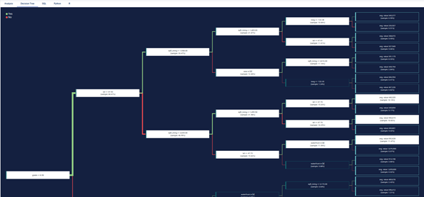
Overview of a Decision Tree in Provision.io’s platform
The graphical representation of a decision tree is often preferred when we want to interpret a model. In fact, starting from the top of the tree, we identify the variables that mostly discriminate the price of houses. In our example, the variables grade, lat and square_living allow a differentiated distribution of the houses according to their sale price.
- The green lines respect the condition grade <= 5.
- The red lines are the opposite segment, which do not respect the
For example, houses whose grade is less than or equal to 8.5 and lat greater than 47.53 and sqft_living greater than 2,035 and lat less than 47.72 and waterfront = 0 then the average sales price of homes in this segment is $ 692,628, and this represents 11.47% of all houses in the learning dataset.
Global explainability
Global explainability consists of explaining the learning algorithm as a whole, including the training data used, the appropriate uses of the algorithms and warnings regarding the weaknesses of the algorithm and its inappropriate uses.
Each model page is specific to the datatype / training type you choose for the experiment in Provision.io’s platform. Screens and functionality for each training type will be explained in the following sections. You can access a model page by two ways :
- clicking on a graph entry from the general experiment page
- clicking on a list entry from the models top navigation bar entry
Then you will land on the selected model page splitted in different parts regarding the training type.
General information
For each kind of tabular training type, the model general information will be displayed on the top of the screen. Three sections will be available.

- Hyperparameters : downloadable list of hyperparameters applied on the model during the training
- Selected feature engineerings (for regression, classification & multi-classification) : features engineerings applied during the training
Permutation Feature importance
From the Interpretable ML Book, permutation feature importance measures the increase in the prediction error of the model after we permute the feature’s values, which breaks the relationship between the feature and the true outcome.
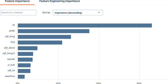
Feature importance : A graph showing the importance of the dataset features. Clicking on the chart, you will be redirected to the dedicated feature page.
We see that lat (latitude) and lon (longitude) are among the most important variables which make sense since the localisation of the house has a high impact on its price.
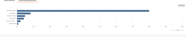
Feature engineering importance : A graph showing the importance of applied feature engineering.
Graphical analysis
In order to better understand the selected model, several graphical analyses are displayed on a model page. Depending on the nature of the experiment, the displayed graphs change. Here an overview of displayed analysis depending on the experiment type.
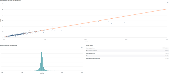
Regression model analysis graphs
Scatter plot graph : This graph illustrates the actual values versus the values predicted by the model. A powerful model gathers the data points’ cloud around the orange line.
Residual errors distribution : This graph illustrates the dispersion of errors, i.e. residuals. A successful model displays centered and symmetric residuals around 0.
Score table : Among the displayed metrics, we have :
- Mean Square Error (MSE)
- Root of the Mean Square Error (RMSE)
- Mean Absolute Error (MAE)
- Coefficient of determination (R2)
- Mean Absolute Percentage Error (MAPE)
Please note that you can download every graph displayed in the interface by clicking on the top right button of each graph and selecting the format you want.
Local explainability
The local explainability module allows you to understand for each instance of the test or validation file and for each model (excluding the set of models) the variables that most explain the score obtained.
You can make more in-depth analysis of the predictions made this way by generating explanations by unit predictions. You can access the explanation screen by clicking on the menu of the table entry for the prediction you wish to explain. (Depending on the complexity of the model and the size of your dataset, the screen may take a few seconds to be loaded).
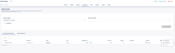
Access the Explain Module by clicking on Prediction File
The local explanations are not calculated by default by the platform, the user must ask for it explicitly. To do so, the user must generate forecasts in the Predictions tab in a file containing the target, and thus be able to access the explain module. However, you can use this option using predict unit API with a simple argument explain set to True.
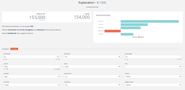
Local Explain Preview
The explanation screen is composed of three parts :
- The “filter dataset”, on the left, allows you to select a specific prediction from your dataset to be explained, as well as apply specific filters to the dataset in order to select predictions you are interested A filter is defined as follows :
- a variable present in your dataset (selected from the dropdown)
- an operator
- a All rows matching the clause will be returned. You can apply up to two filters, and select whether both filters should be applied (“and”), or if a row matching any of the two filters should also be returned (“or”).
- The “explanation”, on the top right, displays the prediction for the currently selected data row, the actual value of the target variable (if it was present in the dataset), as well as the explanation, shown as the relative impact (which can be positive or negative) of the different variables on the final
The Variable influence graph shows the top 5 variables that contribute the most to the predictions, the variables with a blue histogram are the variables that play positively with respect to the target and conversely, the reds contribute negatively. In the example of the Housing prices, the estimated selling price of the house number #1300 is 155,000, while the exact selling price is 154,000.
The Overall Quality, Green Live Area, Garage Cars variables contribute positively to the price (upwards).
On the other hand, evaluating the height of the basement plays negatively in the sale price.
- The “variables” part, on the bottom right, allows you to conduct the “what-if” analysis and see how the prediction and explanations can evolve when the values of the variables are adjusted. When you click on the “simulate” button, both of the predictions and explanations above will be
What if Scenario: We can modify the individual values taken for each variable and thus evaluate the new estimation of the selling price of the house.
Conclusion
For Data Scientists, as well as for users of AI algorithms’ predictions / decisions, it is important, and even essential sometimes, to understand why and how a model came to a given decision / prediction. At Provision.io, we believe it is our role to demonstrate pedagogy in the use of machine learning algorithms, providing a maximum of means for users to inspect, understand and evaluate the quality of the models.
Provision.io is involved in global projects in order to promote the explainability of machine learning models in industrial environments. This is particularly the case with the AIDOART. (AI-augmented for efficient DevOps, a model-based framework for continuous development At RunTime in cyber-physical systems) project which is a three-years funded European project started in April 2021. Its purpose is to use artificial intelligence (AI) and machine learning (ML) techniques to support continuous development of cyber-physical systems.
Provision.io leads the explainability and accountability components of the framework. For the former task, Provision.io will develop tools so as to explain AI and ML models’ outputs, in order to help users of the framework have a better understanding and trust in the AI/ML decisions. The tools are expected to be model-agnostic and able to provide local and global explanations as well as a mix of both.